


Accidental Accessibility Win
TL;DR
People with dyslexia have difficulties reading text. Many of the techniques used to improve readability. Proper fonts, text shaping, spacing, and layout are actually just good practice for all users, not just those with dyslexia.
For the web
p {
    /* Use sans serif fonts designed for screen readability.
       Lexend is specifically designed for readability and to
       reduce visual stress. Verdana and Arial are widely
       available sans-serif fonts also known for good
       legibility. */
    font-family: "Lexend", Verdana, Arial, sans-serif;

    /* Increase the font size to make reading less straining.
       On smaller screens, such as mobile devices, 0.9rem provides
       a smaller font size in needed to fit any amount of text on
       each line . */
    font-size: 1.2rem;
    @media (max-width: 480px) {
        font-size: 0.9rem;
    }

    /* Increase letter spacing (tracking) to prevent letters
       from appearing too crowded, which can improve
       readability for some users. 0.1ch provides a noticeable
       but not excessive increase. */
    letter-spacing: 0.1ch;

    /* Increase spacing between words to help distinguish them
       more clearly. Similar to letter-spacing, this can aid
       readability. 0.2ch adds a small amount of extra space. */
    word-spacing: 0.2ch;

    /* Set the line height (leading) to increase the space
       between lines of text. A value of 1.5em (or 150%) is
       commonly recommended for better readability, as it
       prevents lines from being too close together */
    line-height: 1.5em;

    /* Add space below each paragraph to improve the separation
       between blocks of text, making the overall page easier to
       scan and read. 2em provides a clear visual break. */
    margin-bottom: 2em;

    /* Limit the maximum width of paragraphs to 75 characters,
       which is a common recommendation for comfortable reading.
       This can help prevent text from stretching too far and
       making it difficult to track lines. */
    max-width: 75ch;


}
Intro
I have dyslexia and received my diagnosis way back in the early 90s, before it was widely recognized or understood. My teachers' reaction was typically: "I don't really know what that is. Why can't you just sit down and read?" probably confusing it with ADHD or other conditions. My parents were quite insistent on getting me a diagnosis so I could receive the help that my dad never received when he was growing up.
To be honest, by the time I started high school, I had developed strategies to handle learning, reading, and writing (painful as it was for both me and my parents), and I haven't really perceived it as a disability or disadvantage since.
Looking back, it was probably advantageous that I chose to become an engineer instead of an MD, where the first years of university involved mostly mathematical textbooks. 😄
Symptoms
There are quite a few symptoms associated with dyslexia, but the major ones are:
- Difficulty reading and writing text, with letters and words seeming to jump around
- Difficulty spelling words, often spelling the same word differently each time
There are also some positive traits that seem more common in people with dyslexia, such as high IQ and good abstract reasoning and thinking. And some mostly inconsequential traits, such as having a hard time telling left from right. (I still check for a scar I have, on my left hand, every time I need to distinguish left from right. My 4-year-old seems better at this than I most of the time.)
Reading
This post focuses specifically on the reading challenges of dyslexia, particularly on screens. As dyslexia has become more widely recognized, more accessibility tools and research on the topic have emerged.
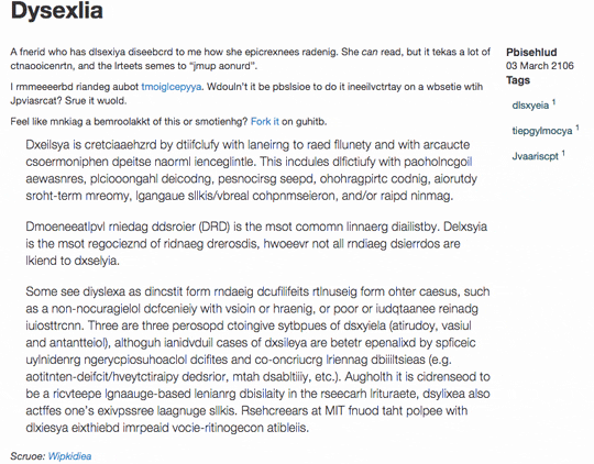
For example, there are specialized fonts like those at opendyslexic.org and dyslexiefont.com that are specifically designed to be readable by people with dyslexia. These fonts focus on making characters as distinct as possible, anchoring each character to the same imaginary line, emphasizing the bottom of the character, enlarging openings, eliminating serifs, and increasing spacing.

Source: dyslexiefont.com
While I do find these fonts make reading easier for me, especially dyslexiefont.com, I personally think they look rather unappealing. They're not something I would willingly use myself or force upon any users.
Takeaways
Looking at the research, there are some clear patterns that can be used to improve the reading experience for users with dyslexia. These patterns likely represent good practice for all users, not just those with dyslexia, as they generally increase readability.
Fonts
Opt for sans-serif fonts ("sans" means without the small decorative strokes at the ends of characters) as they are generally considered more screen-friendly. Look for fonts with distinct character shapes to prevent confusion between similar letters, and those that provide a clear, stable baseline for the text. Many widely available sans-serif fonts can significantly improve readability without compromising aesthetics.
Some good examples are:
- Lexend
fonts.google.com/specimen/Lexend
This font family was specifically designed with the goal of improving reading comprehension and reducing visual stress lexend.com - Open Sans
fonts.google.com/specimen/Open+Sans
A humanist sans-serif known for its open letterforms and excellent legibility. - Noto Sans
fonts.google.com/specimen/Noto+Sans
Part of a Google project to create a harmonious look and feel across all languages, Noto Sans is designed for clarity.
p {
    font-family: "Lexend", Verdana, Arial, sans-serif;
}
Font Size
Once you've selected a suitable font family, setting an appropriate font size is crucial. A common recommendation for body text is around 1.2rem ( 1.2 times the root element's font size, which is often the browser's default of 16px). This results in paragraph text of about 19px, offering good readability.
p {
    font-size: 1.2rem;
}
Paragraph Width
Beyond font choice, the width of your text blocks significantly affects readability. If lines of text are too wide, it becomes challenging for the eye to track from the end of one line to the beginning of the next. This can lead to fatigue, reduced reading speed, and difficulty comprehending the content.
Personally, if lines stretch too far, especially when I'm tired, it becomes almost uncomfortable due to the amount of focus needed to read the text. This is why I get so frustrated with Gmail—it has been around for 20+ years and they still haven't implemented a reasonable max-width for messages.
The optimal line length for comfortable reading is generally considered to be between 45 and 75 characters per line.
p {
    max-width: 75ch;
}
Spacing
Thoughtful use of spacing can significantly impact readability, especially for individuals with dyslexia. When letters and lines are too close together, text can appear as a dense block, making it difficult to distinguish individual words and track lines. Increasing spacing creates visual breathing room, allowing the eye to move more easily across the text.
Letter Spacing (Tracking)
As mentioned in the TL;DR, increasing letter spacing (also known as tracking) can be beneficial. Aim for an increase of around 30% of the average character width.
p {
    /*0.1ch - 0.3ch*/
    letter-spacing: 0.1ch;
}
Word Spacing
Increasing the space between words can also improve readability. When words are too tightly packed, it can be harder to identify word boundaries, leading to misreading and slower comprehension. A slight increase in word-spacing can make a noticeable difference.
p {
    /* 0.1ch - 0.5ch*/
    word-spacing: 0.2ch;
}
Line Height (Leading)
Adequate line height (or leading) is crucial for comfortable reading. When lines of text are too close, the eye can easily jump to the wrong line, disrupting reading flow. A line height of at least 1.5 times the font size (line-height: 1.5em) is a good starting point. For even better readability, especially for longer blocks of text, you might consider slightly increasing this value.
p {
    /*1.5em - 2em*/
    line-height: 1.5em;
}
Paragraph Spacing (Margins)
Creating visual separation between paragraphs helps readers process information in manageable chunks. Adding margin below paragraphs ( margin-bottom) provides this necessary whitespace.
p {
    margin-bottom: 2em;
}
Sources
Some interesting resources on the topic addressing readability in general and for people with dyslexia:
- Lexend
- A Study of the Readability of On-Screen Text, Eric Michael Weisenmiller
- The impact of font type on reading, Stephanie Hoffmeister, Eastern Michigan University 2016
- Contrast and font affect reading speeds of adolescents with and without a need for language- based learning support, Heiner Böttger, Julia Dose and Tanja Müller